
Last week, the District received its results for two school assessment tests: the National Assessment of Educational Progress (NAEP) and the Partnership for Assessment of Readiness for College and Careers (PARCC). NAEP is a national test of reading and math skills given to 4th and 8th graders. PARCC is the District’s replacement for the DC CAS, and it is connected to the Common Core curriculum. The results reveal both good and bad news: District students made important gains in the NAEP scores, but the PARCC results for 10th graders show most high school students are not prepared for college.
What role do demographics play in these test scores? Here are our findings:
- Demographic change among students taking NAEP in D.C. explains only part of the increase in NAEP scores the city has seen since 2005. When we control for changes in race, test scores still rise, just not as much.
- PARCC scores tend to be lower for high schools with larger at-risk populations, though some schools defy expectations, especially charters.
Demographic change explains only part of the increase in NAEP scores (by Kevin Lang)
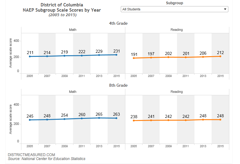
The 2015 NAEP results were mostly positive for the District. Fourth graders posted statistically significant gains in both math and reading. Eighth grade reading scores were unchanged from last year and math scale scores saw a slight decline. The District’s NAEP scores have, for the most part, been increasing during the 10 year period we analyzed.
Comparing multiple years of data could be problematic, especially in a city like ours where there are rapid demographic changes. Since 2005, the proportion of test takers in D.C. that identify as Black continuously declined while the proportion of Hispanic and White students steadily increased.
Given that White and Hispanic students in D.C. consistently out-score Black students on NAEP, does the increase in NAEP scores capture an increase in learning or a shift to students who traditionally do better on such tests?
To answer this question we looked at what would have happened to the NAEP scores if the demographics of test-takers in D.C. had stayed the same between 2005 and now. Our calculations show that even if the racial breakdown of students stayed the same, the District would have still seen growth in NAEP scores, but just smaller. That is, demographic changes influenced test results, but they cannot explain all the increases; it seems learning in the city’s schools has also improved.
| Year | Math (Observed) | Math (Constant) | Reading (Observed) | Reading (Constant) |
| 2005 | 211 | 211 | 191 | 191 |
| 2007 | 214 | 212 | 197 | 196 |
| 2009 | 219 | 216 | 202 | 199 |
| 2011 | 222 | 218 | 201 | 197 |
| 2013 | 229 | 224 | 206 | 201 |
| 2015 | 231 | 226 | 212 | 206 |
Source: National Center for Education Statistics
| Year | Math (Observed) | Math (Constant) | Reading (Observed) | Reading (Constant) |
| 2005 | 245 | 245 | 238 | 238 |
| 2007 | 248 | 246 | 241 | 239 |
| 2009 | 254 | 250 | 242 | 240 |
| 2011 | 260 | 259 | 242 | 240 |
| 2013 | 265 | 263 | 248 | 245 |
| 2015 | 263 | 260 | 248 | 244 |
Source: National Center for Education Statistics
Here, we are collapsing all factors that affect learning into one: race. It is also possible that students moved up the socioeconomic ladder, regardless of race, or that some other change took place among students that would affect their test scores. However, the percent of test-takers who are eligible for free and reduced lunch has fluctuated from year to year, and NAEP results have increased not just across race, but across all subgroups such as gender, disability status, and ELL status. This we take as further evidence that learning has improved.
If you want to further explore how the demographics of NAEP test-takers in D.C. have changed, check out this interactive graph of ours. And to see how the percent of students scoring proficient or above on NAEP in D.C. has changed over time, click here.
PARCC scores tend to be lower for high schools with larger at-risk populations, but some schools defy expectations (by Ginger Moored)
Overall, the PARCC scores for D.C. high school students were pretty abysmal, with only 10 percent of students meeting or exceeding expectations in math, and 25 percent of students meeting or exceeding expectations in English.
As the graph below shows, though, test scores for each high school varied a lot. The larger a school’s at-risk population, the more likely it was to have lower scores—though there were plenty of exceptions, especially among charter schools.
For example, at SEED and Thurgood Marshall—charter high schools where about half of the students are at-risk—around 60 percent of students met or exceeded expectations on the English test (which is about twenty percentage-points higher than schools with similar at-risk populations).
If you’d like to sort through the PARCC data yourself, and compare the scores at different schools for different types of students (black, white, male, female, etc.), you can use the interactive graphs below.
| School Name | Sector | % Meeting/Exceeding Expectations |
|---|---|---|
| School Without Walls | DCPS | 97% |
| Banneker | DCPS | 74% |
| Basis | Charter | 73% |
| SEED | Charter | 64% |
| Washington Latin | Charter | 63% |
| Thurgood Marshal | Charter | 57% |
| Wilson | DCPS | 50% |
| Ellington | DCPS | 50% |
| National Collegiate | Charter | 33% |
| Capital City | Charter | 33% |
| Chavez-Cap Hill | Charter | 31% |
| McKinley | DCPS | 30% |
| Paul | Charter | 22% |
| IDEA | Charter | 20% |
| Richard Wright | Charter | 20% |
| Hospitality High | Other | 19% |
| KIPP-College Prep | Charter | 18% |
| Phelps | DCPS | 17% |
| Washington Math Sci Tech | Charter | 17% |
| Columbia Heights | DCPS | 16% |
| Eastern | DCPS | 11% |
| Coolidge | DCPS | 9% |
| Dunbar | DCPS | 8% |
| Chavez-Parkside HS | Charter | 8% |
| Friendship-Collegiate | Charter | 8% |
| E.L. Haynes | Charter | 6% |
What exactly is this data?
NAEP data is from the National Center for Education Statistics NAEP Data Explorer.
PARCC data is from the Office of the State Superintendent of Education (OSSE), DC Public Schools, and the DC Public Charter School Board. At-risk data is from OSSE. An at-risk student is defined as a student who is homeless, in foster care, qualified for food stamps or TANF, or a high school student who has been held back a grade.